How to choose background for design
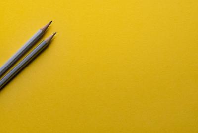
Definitely, the background would be one of the most important factors that would reflect and emphasize as well as support the brand or the message. When the background design is powerful, then the information you want to communicate would be delivered with high impact and influence. When the background would be poor, then it would be weakening the information and the message. Don’t go for a boring background. Be creative and use bright colors that would naturally draw the attention of the eyes of the customers to your brand.
The Background color psychology
The colors that are used are having the ability to create and influence as they can relate and associate between the customers and emotions. Some colors would be cool, others would be daring, others would be relaxing and thus, it would be important to associate between the colors and the psychological effect since color affects the mood of the person.
- Red color: is a vibrant color and it is stimulating as well as energizing. It is a warm color and it can be easily drawing the attention of the customers to the design and the message. When the red color is used in the background, then it would be associated with positive feelings and energetic feelings.
- Green, Blue, and Purple colors: these colors are considered cool colors. They would be sending feelings of relaxation, soothing, and chill.
- Dark Blue color: this shade of blue would be usually reflected dignity and formality.
- White, Black, Beige, Browns, Taupe, and tan colors: these colors are considered neutral colors and they would be usually reflected simple and clean as well as refreshing feelings. They would be also adding warmth and reflecting light or gravity or nature.
Read also: Colors Meaning Chart
The background designs and types have been evolving through time and there are some basic designs as the solid or the slight gradient, or the illustration or the background with a photo or the background with a video at the back or the subtle pattern or the bold pattern. Moreover, there are plenty of design ideas that you can consider when designing the background. However, you have to be very careful when choosing the right design as it can serve your message or it can weaken it. In the choosing of a patterned background, then the colors have to be having from 2 to 4 colors that are dominant and try not to use more colors as it will lead to look cluttered and lead to the distraction of the customers away from the message and the information they are looking for. If you choose one color as white, then be sure that you are having a brand that is reflecting the freshness, nature, or minimalism as white color only is perceived as being boring.
Solid Color or Gradient Background
This is usually very popular and it is the classical appearance of the background as it would be using a single color or a color with a subtle gradient. They would be very effective when the project requires printing and they can be designed with any color scheme.

The use of Neutral hues would be usually the color of choice for the solid color background. Usually, designers would go for single color or bolder single color as this way they would be able to deliver simplicity to the whole look and design. The flat design principles would be showing that people are mainly attracted to the color and the simple application of the elements and the typefaces. Gradient colors would be either fade to white or they would be fade to black or they would be having a combination of some colors.
. Subtle Pattern
This is very popular as well as it would be creating texture and it can be achieved by the addition of three-dimensional feel as well as in the case of the printed projects, they can be including texture element in the design. Subtle patterns are usually designed by relying on shapes and lines as well as small images.
. Bold or Large Pattern
This is working as with the large patterns and the oversized ones and they would be relying on the use of high color. It would be working perfectly when there would be fun ways that the background design can work through. Usually, the designers would be choosing the bold and the large patterns as a key elements when they want to convey a certain message of their design. The bold patterns would be creating a certain mood and they would be reflecting the fun and lighthearted feelings.
. Photo or Video
The use of a photo would be perfect as photos can deliver the entire message through the visualization. The idea and the story of the photo or the video can help you deliver the message perfectly without words and the need to explain. They are very effective. They can create connections and establish communication and engagement with the customers.
Read also: Free Online Photo Effects
If you need more design ideas that can support you in creating the background, check Tasmimak for the best design.
Read Also
-
Essential Tips for Night Photography
-
Guide To Create Social Media Designs 2024
-
10 Famous Company Logos & Their Messages backing them up
-
404 Error Page Design Ideas
-
Application Letter Samples and Templates
-
Awesome Graphic Design Trends 2025
-
Benefits of Banner Advertising
-
Best Elegant Font fot your Design
-
Best Free Fonts
-
Best Free Fonts For Designers