How to Choose Brand Colors for Your Business

It can be very intimidating to create your own color scheme. However, it is not as complicated as people might say. Color combinations have different impacts and influence the perception of the customers. They have conscious impact and subconscious effects. The colors that you apply can work the best with your brand identity or they might work against it. Selection of the color combination has to be carefully chosen. It leads to drawing the attention of the website visitors and it is a way to express your brand identity through it. Choose the right and suitable color for your logo template, business card design even packaging design to serve your product or service to make people notice you easily. Even using the colors to express your brand on Instagram posts and Facebook ad design.
What is color terminology?


Color Combinations trend in 2024


Read also: How to select the best font for your brand
How to choose color combinations for websites?
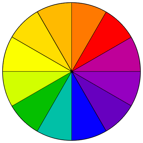
The first step is to be familiar with the color terminology. There are different terminologies that express color. Hue refers to the color of something as it can be red or blue. Chroma refers to the purity of the color as for example it is pure white or it has some touches of grey or black to it. Saturation expresses the strength of the color or its weakness. Value refers to how light or dark the color can be. The tone is how the color is created through the addition of grey color to it. Shade is when the color is formed by the addition of black to a hue color. The tint is when a white color is added to the hue.
Color combination types of schemes
Monochromatic color combinations are the schemes that are formed by variations of tones, shades, and tints that happen to a specific color hue. Monochromatic schemes are very easy to be formed; yet, they could be very boring if they have not been applied in a creative or good way. One of the ideas is to add a strong color that can keep the rest in a neutral way as white or black would help in keeping the scheme creative and not boring. Analogous color combinations are schemes that are very easy in their creation. They are formed by the use of three colors that are added to one another on the color wheel. Mostly, these schemes have the same chroma levels through the use of tones, shades and tints. These schemes can be looking very interesting and they could be well adapted in a way to meet the requirements of your design.
These schemes are formed through the creation of a color combination by using colors from opposite sides of the color wheel. It can be formed in a basic form through the use of only two colors and it can be complex through having more tones, tints, and shades. However, when using two opposite colors on the design, it might lead to visual jarring. You can solve this issue by using a color that is transitional between them. These schemes are very complex in their design and it is the use of colors that are located beside each other in the color wheel from the same side. It can be adapted well through the use of color from every side of the hue that is opposite to the other. These schemes are formed by the use of hues that are placed on equal spacing on the color wheel. It is considered one of the most diversified color schemes. It is not considered easy to make. However, it is one of the best forms of visual interest to a design when they are applied effectively.

Custom color schemes are considered the hardest ones to be created. They do not follow a predefined color scheme. It has no formal rules when creating it. After we have gone through the color terminology and the color combination schemes, let’s try to create some graphic designs. There are many online tools that can help in the creation of very attractive colorful designs such as Tasmimak, you will find hundreds of editable design templates which are easy to use and customize.
Read also: AI art generator
First is trying to avoid the use of pure color hues and start to use tints, shades, and tones. Then, you can add another hue color which would be three spaces away. It is an accent color. It shall be leading to the creation of visual interest and keeping a sense of balance. Neutrals as grey, white, and black, brown, tan or off-white are the neutral colors. If you are looking for a warm design, you can choose tans, brown, and off-whites as they are shades, tints of yellow and orange. Grey as a neutral color, can create a warm or a cool color when it is used effectively along with the colors surrounding it.
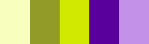
Using a bright color that is an accent to a neutral palette is a very easy and yet, eye relief palette. Many websites would go with the use of three colors only while others would rather use two. Some would be using eight or more colors. The best way is to apply a palette of 5 colors and then, start adding or removing the colors till you reach the best design.
You can read more through our blog. Remember that you can create designs with us using the right color composition, based on a color wheel and using complementary, split complementary and triadic schemes. Visit Tasmimak
Read Also
-
Essential Tips for Night Photography
-
Guide To Create Social Media Designs 2024
-
10 Famous Company Logos & Their Messages backing them up
-
404 Error Page Design Ideas
-
Application Letter Samples and Templates
-
Awesome Graphic Design Trends 2025
-
Benefits of Banner Advertising
-
Best Elegant Font fot your Design
-
Best Free Fonts
-
Best Free Fonts For Designers