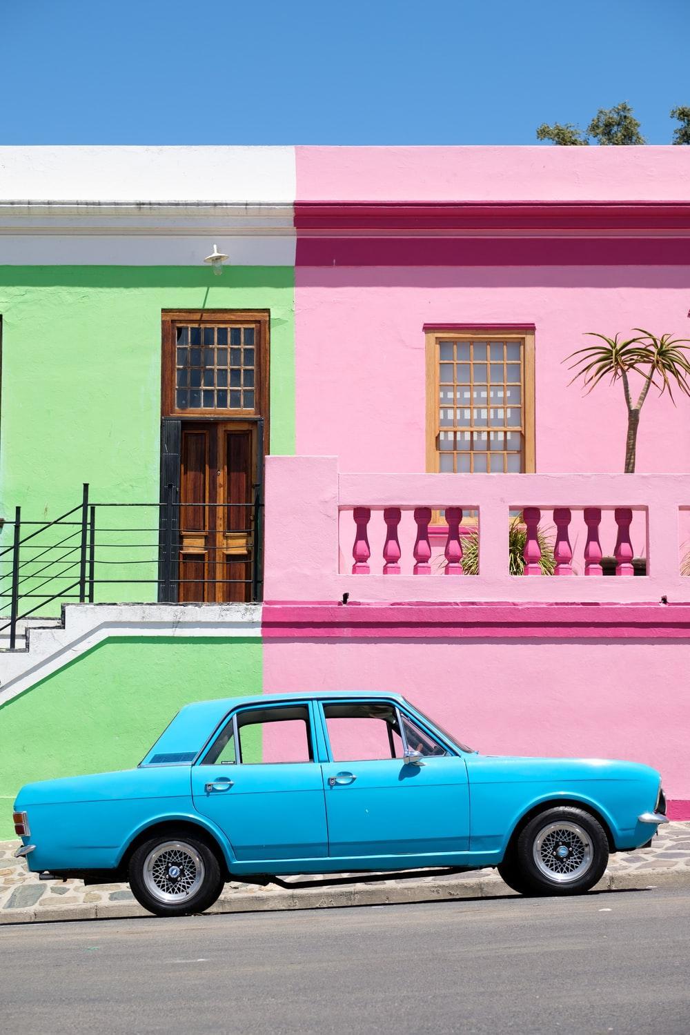
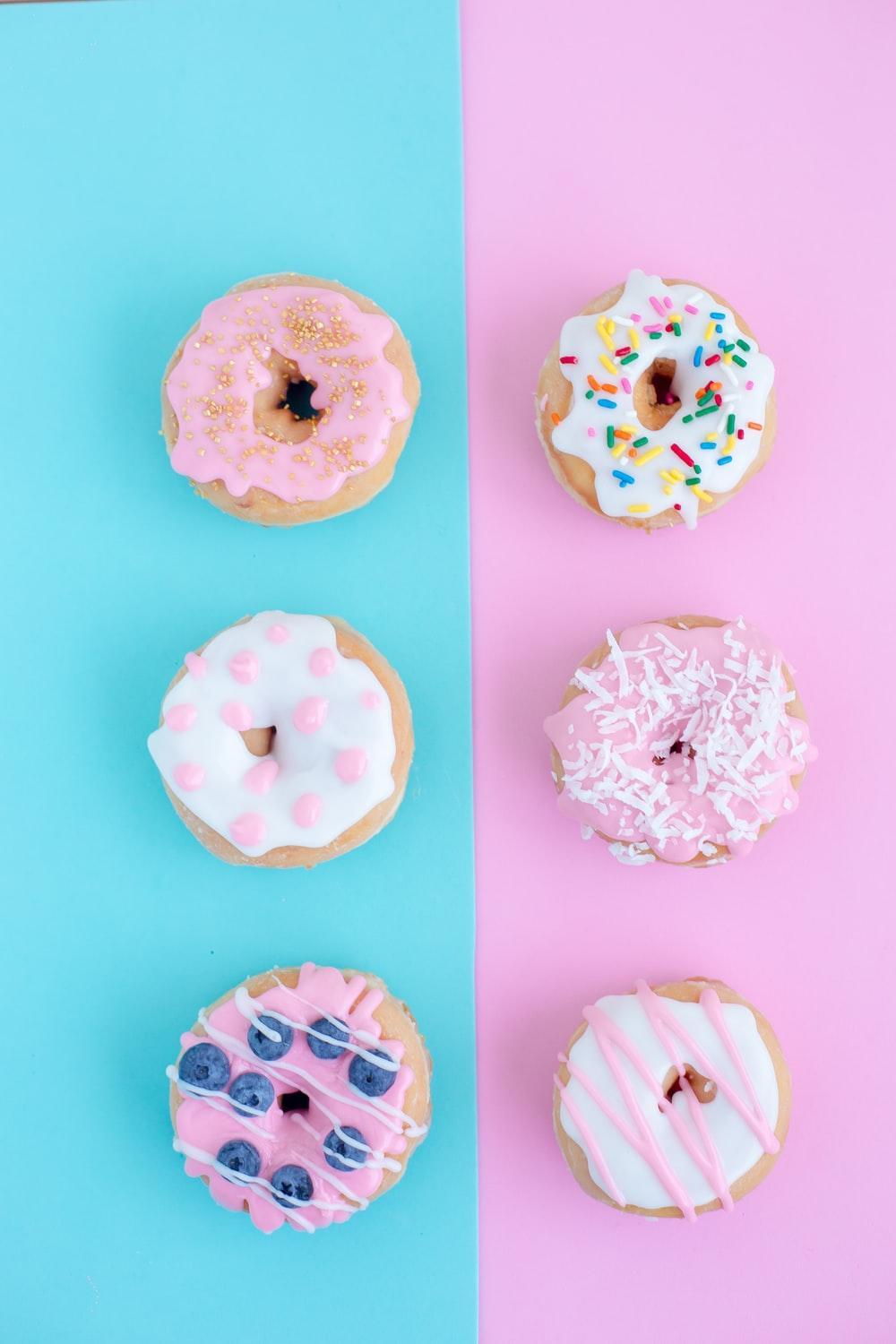
Top Pastel colors Design Templates
Pastel colors are one of the charming colors. No wonder that they remind you of cotton candy, ice cream, baby clothes, unicorns, candies, creams, and many others as they are described as soothing colors. Pastel colors belong to the calm family of colors. They are not bright. They are not meant to alert you. They have their magic and thus, they are described as the HSV color space. Their value is very high and yet, their saturation of colors is very low. They are characterized by being soothing and relaxing.
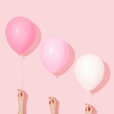
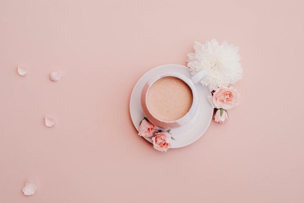
Some of the well-known colors of Pastel colors are Pink, baby blue, and mauve. In addition, there are others that have a high influence when they are used as the peach, the periwinkle, the magic mint, the lavender, and others. Some of the top design templates in 2024 have been based on the use of pastel colors.
Pastel colors started to be a trend in 2018 and it is going strong till 2024. Pastel colors started to be used in establishing brand identities, brand schemes, fashion trends, social media pages, interior designs and décor, brochures, product packaging, and many others.
Read also: The science of colors for kids
What Are Pastel Colors?
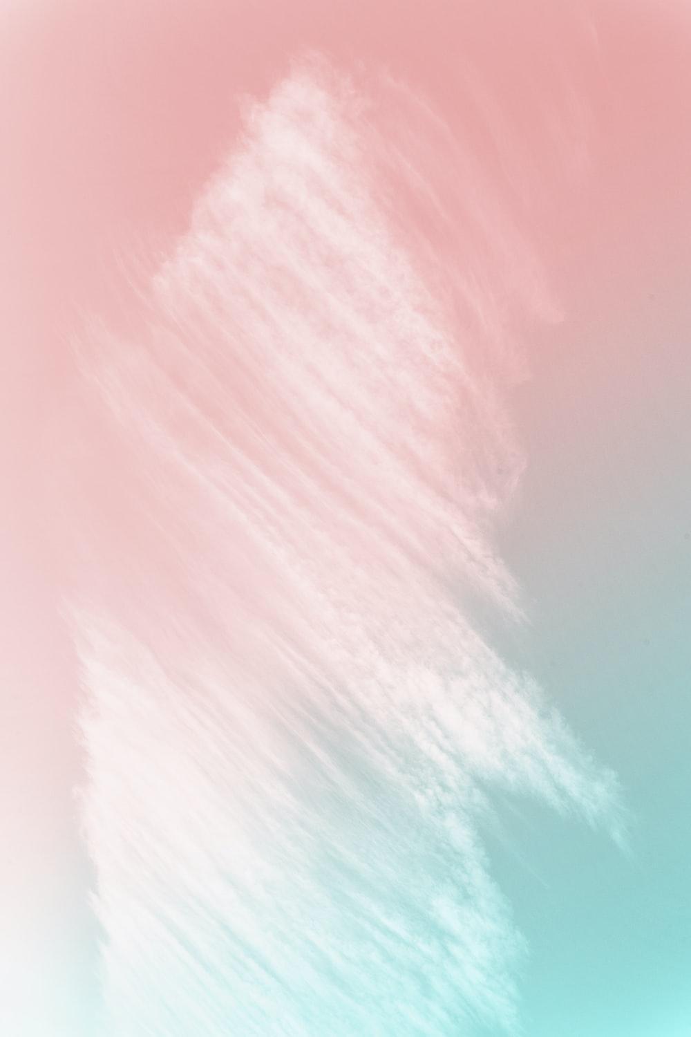
Usually, any pastel color is having enough white that is mixed with its hue color in order to create a pale look and a soft one and at the same time, it keeps its personality and identity. Examples of mixes that have created a very soft impact in many brands in the light azure, creamy mint, millennial pink, and the whimsy yellow.
Many times, the high saturated color would be very intense for the idea. The mixing of the hues and the white would be very fit for many businesses as the summer products, summer fashion, facial products, women, children, babies, and night products.
Pastel colors are considered a growing trend in logo designs. In the past they have been considered as very chic colors or as children colors, but not anymore. Designers started to rely heavily on pastel colors for the successful impact they make on the customer. Over time, customers started to be attracted more to pastel colors compared to other colors. One of the trending ideas is the mixing of pastel colors to provide more great and charming colors. They emit a soothing aura to the image and to the brand. You can always try to mix them together as the light grey with the lavender and baby blue.
How Colors Influence Your Video Audience?
One of the most influential elements is color. Colors are used to leverage a feeling and to inspire others to develop certain feelings or arouse certain feelings. Colors are used to develop brand personality and to develop associations with your customers and audience. Pastel colors have a lot of associations with color psychology. They can naturally inspire your audience. Moreover, you can take advantage of the color mixes and create powerful designs.
Read also: Font psychology
The psychology of Pastel colors
According to studies, the color psychology of pastel colors is associated with the following to the minds of the customers:
- Soothing and relaxing: Pastel colors are having a very low saturation of colors and a lot of white colors mixed in them. They have a calming and softer look. They aspire to the customers with peaceful vibes.
- Romance: Pastel colors are always inspiring romantic vibes. They can fit well especially with the use of a romantic image or product.
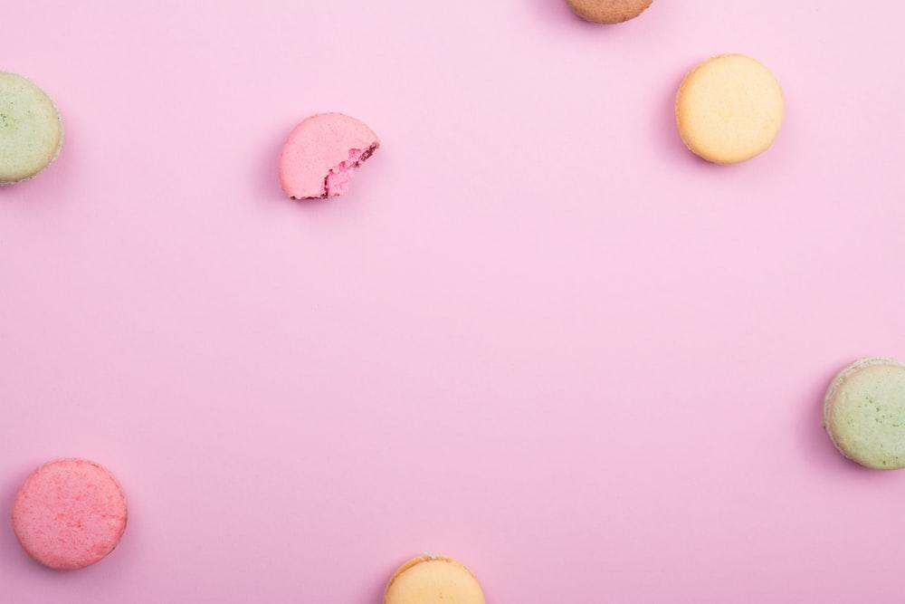
- Spring and freshness: pastel colors are always perceived as spring colors. Feeling of happiness, joy and new beginnings are usually associated with pastel colors.
- Baby-centric: pastel colors are colors related to babies, their pinkish cheeks, their clothes, teddy bears, unicorns, candies, and when we see pastel colors, babies come to our minds. Some of the colors are Pale blue, or pink, and yellow. Nurseries usually depend on these colors to create the effect of babies’ haven.
Pastels Color Trends
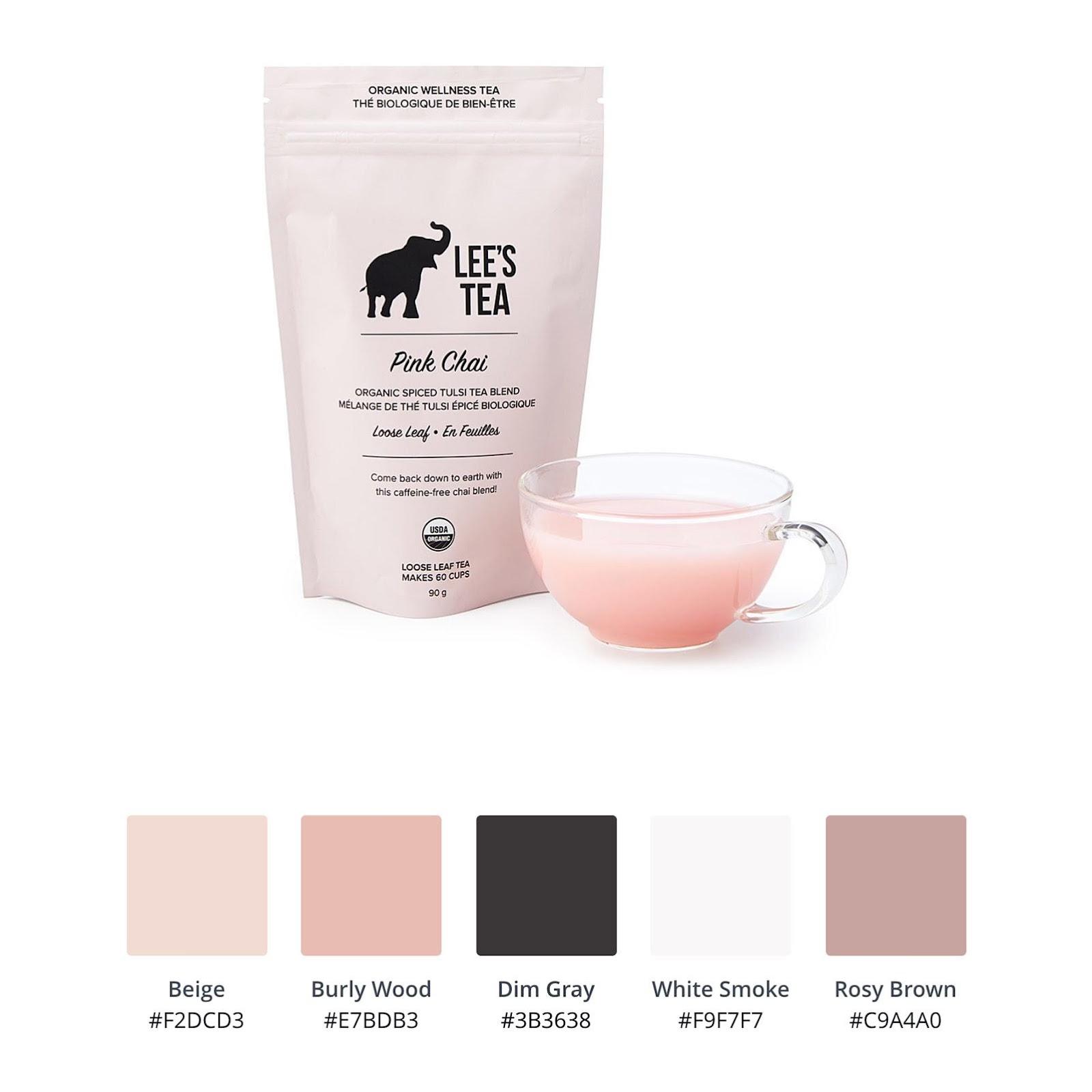
- Lee’s Tee’s Pink Chai Tea
The packaging design of the product gives feelings of soothing, calmness, and relaxing emotions. It is the perfect color palette for linking it with tea. It contrasts the pink color and the black letters.
- Bakery’s logo
The pale pink color in the bakery’s logo in the design would be reflecting sweetness and that is the perfect choice for your taste buds.
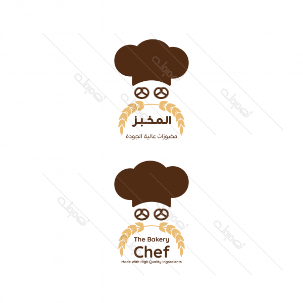
Browse More Food Logo Templates
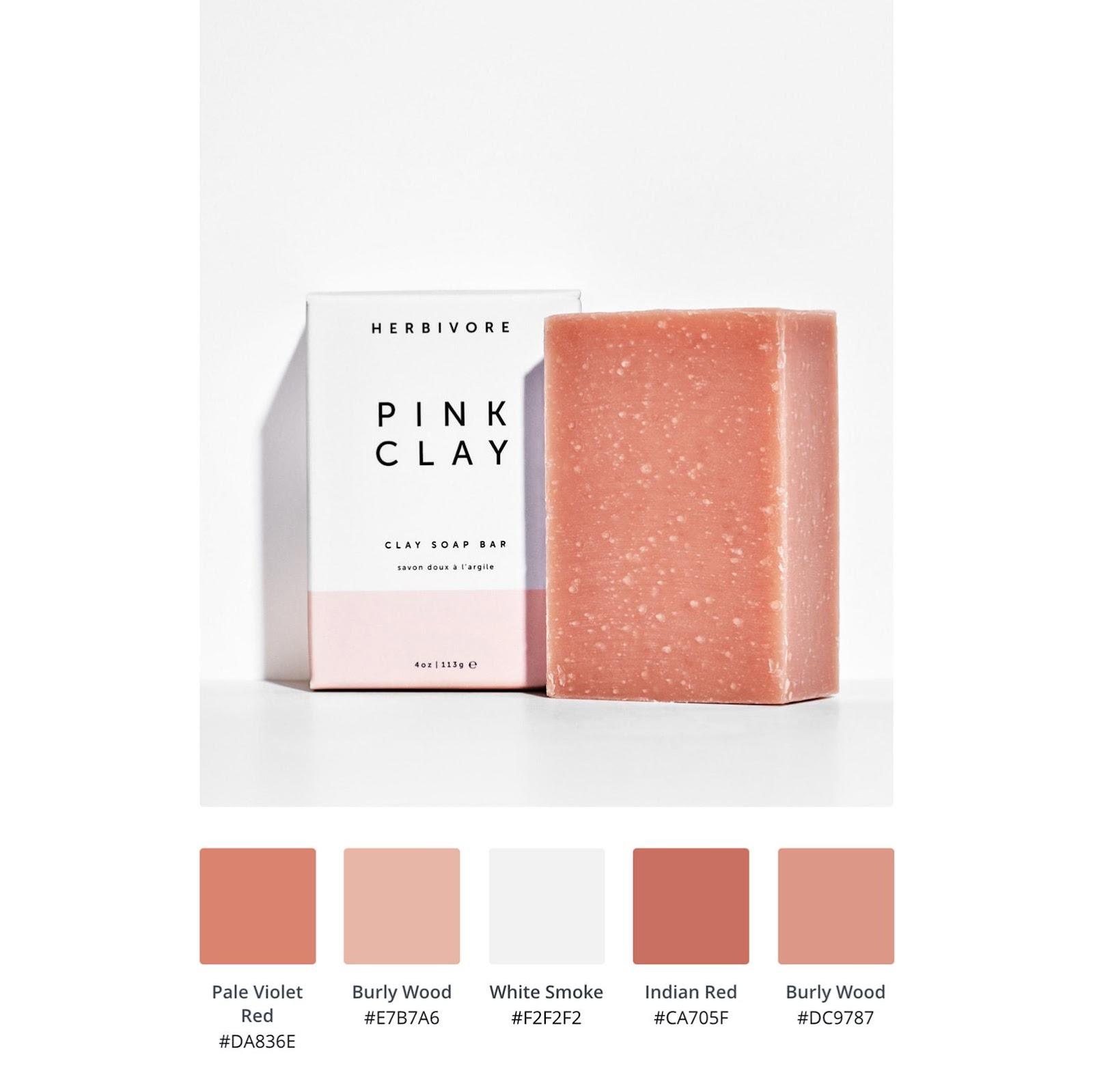
- Herbivore Botanicals Pink Clay
The pastel pink clay soap packaging is showing a reflection of the brighter coral hue that is in the soap. It is paired with pastels that have many saturations of color. It is showing the depth of the color and yet, it is very simple.
Click here for more articles. If you are looking for the perfect combinations and designs of the pastel colors, you can visit our website for helping you to get the best emotions from your audience once they see your logo design or brand. Check Tasmimak!
Read Also
-
Essential Tips for Night Photography
-
Guide To Create Social Media Designs 2024
-
10 Famous Company Logos & Their Messages backing them up
-
404 Error Page Design Ideas
-
Application Letter Samples and Templates
-
Awesome Graphic Design Trends 2025
-
Benefits of Banner Advertising
-
Best Elegant Font fot your Design
-
Best Free Fonts
-
Best Free Fonts For Designers