How to Create a Monochromatic Color Scheme
This is one of the most creative looks that you can have inside your home as it would be reflecting a harmonious look through the use of the monochromatic color scheme. It would be usually thought to be a way of decoration. However, the basics of monochromatic color would allow you to create numerous designs that are breathtaking.
What Is a Monochromatic Color Scheme?
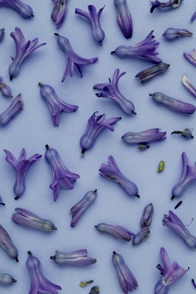
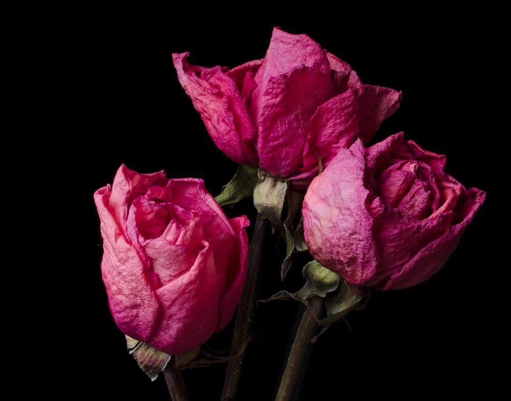
They are usually the designs that are based on the use of a single color and they would be having various shades and tones that would be reflecting the differentiation in the space. There would be no hues that would be used in the monochromatic color scheme. Monochromatic is not referring that one color that is used in its value only through the design but it would be meaning just “one color”. The one color can be used in many ways through variation of the one color and that is the refining of the color. Neutral color schemes would be called and considered monochromatic and they would be having variations that would be of the neutral color itself.

Basic Color Terms before using the monochromatic scheme
-
Color (or Hue): It is the Color that is having a high quality of an object or substance with respect to light reflected by the object. Colors are what we refer to when we say “blue” or “orange.”
-
Value: The value of a color is simply the lightness or darkness of a color.
-
Tint: A tint is a color after white has been added. The value of the color has been lightened with the addition of white.
-
Shade: A shade is a color after black has been added. The value of the color has been darkened with the addition of black.
-
Tone: A tone is a color after gray has been added. The value of the color has been muted with the addition of gray.
Monochromatic Color Scheme in Designs
If a monochromatic scheme relies on one color, how do you use it in creating multi- designs? By choosing one color and using tones, shades, and tints, of that same color. Using variations of the same color can create different designs.
In the variation of color that can be used in the designs, through the use of tones, hues, and tints, the new color can be protected against being monotonous, and monotonous is that the color is generated from only one color. The monochromatic color scheme can actually be monotonous when it is used as-is without having tones and shades that can be used. Textures and Patterns – these are one of the very creative secrets that you can use and apply the monochromatic color as it would be creating the Perfect Monochromatic Color Scheme
Read also: Colors Psychology
One of the most creative ways is to use texture and prints that are having the same hues and shades. The texture can be showing light and dark even when you are using the same color. You can add icons, images, background, text fonts, and designs that would be increasing the visual interest without giving up the monochromatic look. The use of neutral color or two of it would be added to the nonneutral scheme would be adding more theme and attractiveness. Patterns are a great way to add depth to your monochromatic color palette but, they have to be used sparingly in case your goal is a simple and harmonious style.
How to Create a Neutral Monochromatic Color Scheme
Most of the designs that would be having neutrals would be showing one of the very good designs that would be matching products that reflect tranquility, relaxation, and calmness. In the planning of the color palette that you would be using, then the neutrals would be perfect if you are targeting females as well as products that reflect freshness, skincare products, and adult segments. If you will be adding neutral colors to your palette, build on the ones that already exist in the space. By unifying your neutrals, and using the same monochromatic principles on them, the result will be more cohesive. If you’re designing a monochromatic color scheme based on neutrals only, then consider the patterns and the textures in the design. They can be able to reflect warmth in the design as well as they would be filling the negative space with warm colors.
Read also: Ai Design Generator
Through using light and shadow variations of one color is creates harmony and attractiveness. Simplicity and minimalism is the key to many of the designs and it shall be creating the perfect mood. If you want to customize more designs and looking for appealing designs. Check Tasmimak so that You can tailor-make your designs that convey the messages that you want to send.
Read Also
-
Essential Tips for Night Photography
-
Guide To Create Social Media Designs 2024
-
10 Famous Company Logos & Their Messages backing them up
-
404 Error Page Design Ideas
-
Application Letter Samples and Templates
-
Awesome Graphic Design Trends 2025
-
Benefits of Banner Advertising
-
Best Elegant Font fot your Design
-
Best Free Fonts
-
Best Free Fonts For Designers