Famous logos with hidden messages
Logos prove that innovation, inspiration and creativity are real! They prove that never take the first glance for granted and have a second look as you would get your mind blown. Tasmimak's logo maker is the best choice if you want to have a stunning logo design. Here are some of the famous logos of the world with their hidden meanings, in addition to some of our amazing logo templates.
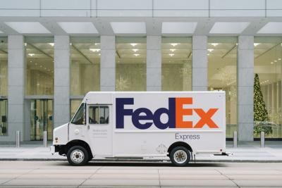
FedEx Logo
The shipping company logo is actually having one of the best logos in the word concerning the hidden image as when you have a closer look between the E and the X letters, there would be a negative space that would be shaping an arrow. The arrow is showing that it is reflecting moving forward with high speed and precision and that, there would be an element of surprise which is that they go forward with speed. The logo design has around 40 awards and it is ranked among the best logos of the world.
Wendy’s Logo
The Wendy’s brand identity is reflecting a personal as well as “home-cooked” feeling. Once you have a closer look then you can see that Wendy’s collar v has the word mom and the name Wendy’s has been named after Thomas’s daughter and who now has more than 6,500 chains that are present worldwide. Some logos can leave an unconscious imprint in our minds for a long time.

Baskin-Robbins Logo
Baskin-Robbins is owned by Dunkin’ Brands, and it is known for having around 31 flavors. The logo is having the colors of pink and blue that would be shown in the BR and it is doubling as 31 which are the flavors. The logo reflects the fun and energy of the brand and the product that it is offering. The company is also saying that 31 are the beliefs that the guests would be having the opportunity in the exploration of fun and new flavor of ice cream every month.
Learn how to use AI art generator
LG Logo
When you see the logo for the first time, then you see the dark pink logo for LG Electronics looks like a winking face. But once you would be having a closer look, then you can identify the face’s “nose” is an “L” and the outline of the “face” is a “G.” Some may say that there is a similarity between LG’s logo and a modified Pacman.
Tostitos Logo
The logo for tortilla chips and dips is providing an example that is once you have seen it then you cannot ignore it and the logo is in the name as the name Tostitos would be showing colored background and the two T letters would be making up people who would be dipping the tortilla chip together in the bowl that is having salsa which is the top of the I letter.

Hershey’s Kisses Logo
The hidden logo of the Hershey’s kisses would be having the extra kiss and when you turn your head to the left, then there would be a kiss located between the K and the I letters. It is themed as an amusement park which is Hershey Park.
Toblerone Logo
This chocolate that is well known in every part of the world was primarily having its first factory in Bern in Switzerland and this city was usually having bears. The logo would be showing the mountains and the bear of the city of Bern.
Read also how to build a strong brand identity
Pinterest Logo Design
This is a digital pin board site that has a logo tied to its social network core. It is having a hidden image that is not very obvious and it is fitting in the platform. The letter P would be doubling and it would show the pin. The P would be lending itself to the shape of the map pin.
Goodwill Industries International Logo
This is a community and public based organization and it is trying to sell the donations of other people at a very low price in order to help those who have low income to have better lives and it shows this action through its trademark. It is not for profit that would be having functional as well as encouraging letters as the lowercase letter in the G as in goodwill and the smiling face that is showing two times in the logo.
Formula One Logo
Formula One has considered the core values of sports and it has applied them in its logo. It has red color in it which reflects passion and energy as well as the black color would be representing power and determination of the company.
The Bronx Zoo Logo
It is the largest zoo in North America and it is located in the Bronx which is in New York City and it is considered the largest in the metropolitan zoos in the world. The logo of the zoo is showing birds and giraffes that would be reflecting the homage of New York City. You can see the Skyline of New York City between the legs of the giraffes.

Check also the best graphic design school
It is super easy to create designs whatever your business is including logos, stamps, business cards and more through using fully customizable graphic design templates which are provided for free or at low cost by Tasmimak. Visit Tasmimak and start your design!
Read Also
-
Essential Tips for Night Photography
-
Guide To Create Social Media Designs 2024
-
10 Famous Company Logos & Their Messages backing them up
-
404 Error Page Design Ideas
-
Application Letter Samples and Templates
-
Awesome Graphic Design Trends 2025
-
Benefits of Banner Advertising
-
Best Elegant Font fot your Design
-
Best Free Fonts
-
Best Free Fonts For Designers