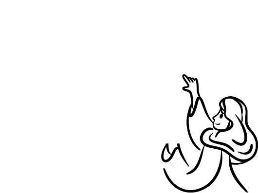
صمم بنفسك الآن..
وفي لحظات
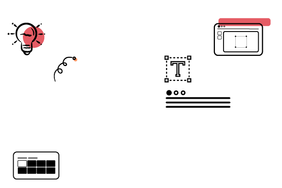
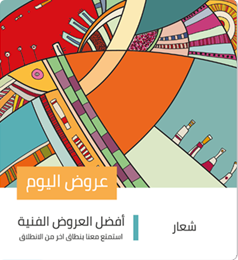
تصفح التصميمات 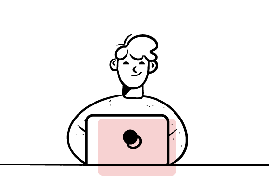
اختر وعدل تصميماتك
بسهولة
تصفح التصميمات 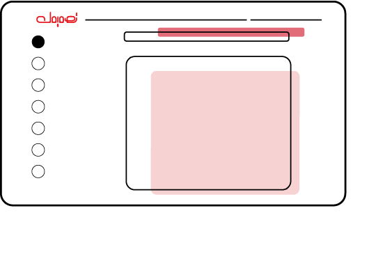
تصميمات باللغة العربية
جاهزة لك
تصفح التصميمات 

سعر مميز

السهوله
محتوى عربي
ما هو تصميمك؟
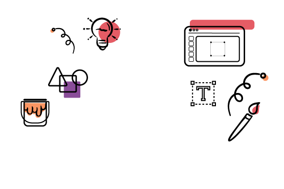
تصميمك هي منصة لتصميم الجرافيك تسهل على الجميع إنشاء الشعارات، منشورات وسائل التواصل الاجتماعي، بطاقات العمل، و جميع احتياجاتهم التصميمية باستخدام أدوات سهلة.
صمم بسهولة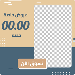

1
2
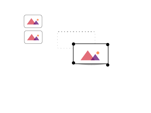
عدل تصميمك
أنشئ، وعدل، وأبدع في تصميمك خلال ثواني

3
استمتع بتصميمك
شارك تصميمك وأظهر للعالم ما يمكنك فعله
اسئلة متداولة
تصميمك هو منصة إلكترونية لتصميم الجرافيك تجعل من السهل على الجميع إنشاء الشعارات، ومنشورات وسائل التواصل الاجتماعي، وبطاقات العمل، وجميع احتياجاتهم التصميمية باستخدام أدوات سهلة وقوالب عربية مميزة.
كل الباقات تحتوي علي القصاصات المجانيه والاشكال والخلفيات الرائعة
كل انواع التصاميم ، اذا لم تجد ما تحتاجه ، اتصل بنا علي الفور وسنقوم بعمل اللازم
يمكنك إختيار إحدى الباقات المتاحه والاشتراك بها ، هذا كل مايجب فعله ، وبعدها يمكنك أن تستمتع بكل التصميمات المدفوعة
لا تحتاج إلى أي خبرة في تصميم الجرافيك، حيث تم إنشاء تصميمك ليكون الطريقة الأسهل في التصميم.
يمكنك البدء في التصميم من خلال تصفح التصميمات، واختيار التصميم المناسب سواء مجاني او مدفوع ، في حالة التصميم المدفوع قد تحتاج لترقية حسابك ، بعد فتح التصميم يمكنك تعديله بنفسك وبسهوله وبدون خبرة في التصميم من خلال محرر التصميمات من منصة تصميمك